Components
Every built-in, with the JSX you write and the native render it produces — screenshots straight off the iOS Simulator, regenerated from the gallery app. Capitalized tags compile to binary ops; styling is props; testID and semanticLabel ride Flutter's real semantics tree.
demos.jsx, same widgets as the iPhone captures below — step
through them. (There's also a 65 KB Solid→DOM build of the same app.)
Content · Layout · Input · Lists · Navigation · Effects
Content
<Text> → Text
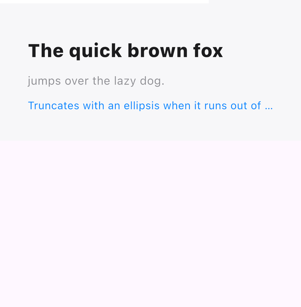
Styled text — size, weight, family, color, alignment, maxLines, overflow.
<Text label="The quick brown fox" fontSize={24} fontWeight={800} color="#FF1C1C1E" />
<Text label="jumps over the lazy dog." fontSize={15} color="#FF8E8E93" />
<Text label="Truncates with an ellipsis when it runs out of space to work with"
      maxLines={1} textOverflow={1} fontSize={14} color="#FF0A84FF" />
<RichText> → Text.rich
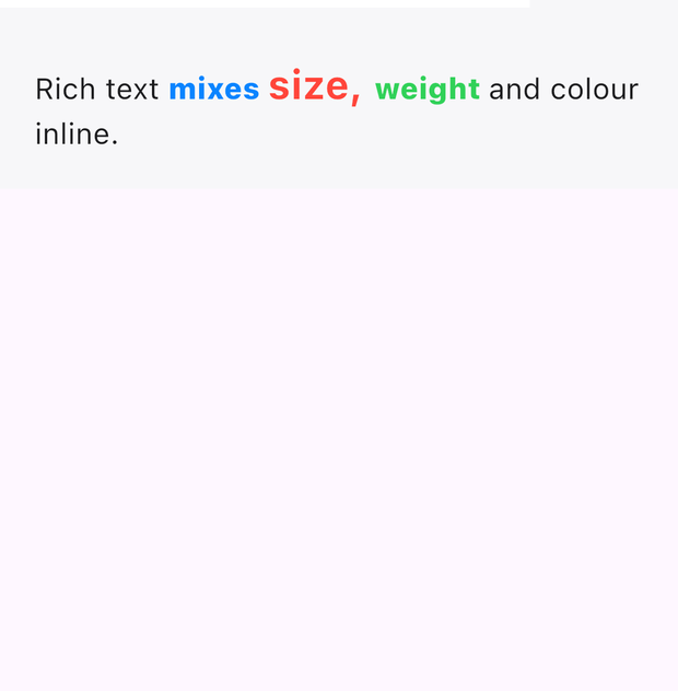
Inline spans — each Text child becomes a styled TextSpan.
<RichText>
  <Text label="Rich text " fontSize={17} color="#FF1C1C1E" />
  <Text label="mixes " fontSize={17} color="#FF0A84FF" fontWeight={800} />
  <Text label="size, " fontSize={23} color="#FFFF453A" fontWeight={700} />
  <Text label="weight " fontSize={17} color="#FF30D158" fontWeight={800} />
  <Text label="and colour inline." fontSize={17} color="#FF1C1C1E" />
</RichText>
<Image> → Image
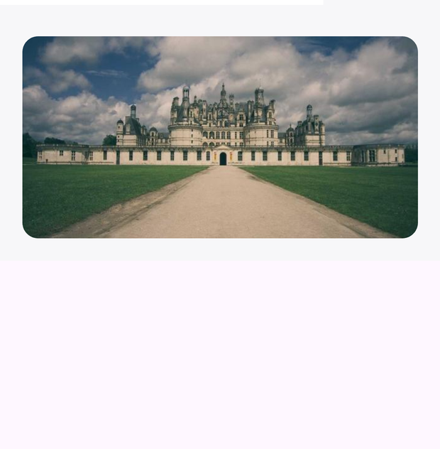
Network, file://, or asset:// sources; BoxFit via contentScale.
<Image src="https://picsum.photos/seed/skal/640/360"
       width="fill" height={180} contentScale={1} cornerRadius={14} />
<Canvas> → CustomPaint
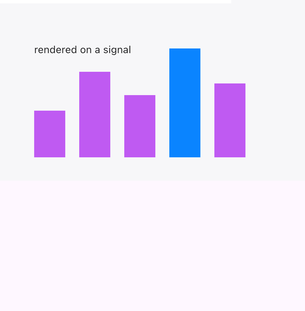
A chainable 2-D drawing context — rects, circles, paths, text. Reads signals; redraws when they change.
<Canvas width={320} height={180} draw={(c) => {
  [60, 110, 80, 140, 95].forEach((v, i) =>
    c.fillStyle(i === 3 ? '#FF0A84FF' : '#FFBF5AF2')
     .fillRect(24 + i * 58, 170 - v, 40, v));
  c.fillStyle('#FF1C1C1E').fontSize(13).fillText('rendered on a signal', 24, 24);
}} />
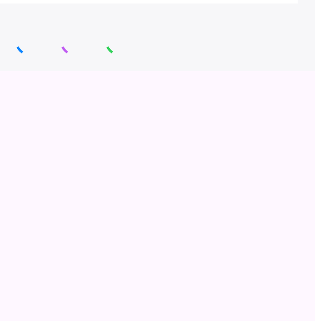
<ActivityIndicator> → CircularProgressIndicator
Indeterminate spinner; color and size are props.
<ActivityIndicator color="#FF0A84FF" width={36} />
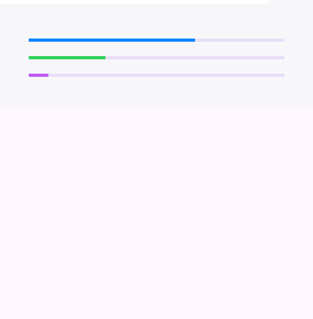
<ProgressBar> → LinearProgressIndicator
Determinate with progress 0..1, indeterminate without.
<ProgressBar progress={0.65} color="#FF0A84FF" />
<ProgressBar color="#FFBF5AF2" />   {/* indeterminate */}
Layout
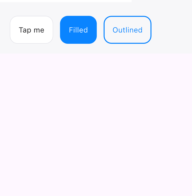
<Box> → Container
The decorated box — padding, background, corners, borders, shadows, tap/hover/drag handlers.
<Box padding={18} background="#FFFFFFFF" cornerRadius={16}
     borderWidth={1} borderColor="#FFE5E5EA" shadow={8}
     onTap={() => setLiked(!liked())}>
  <Text label="Tap me" fontSize={15} color="#FF1C1C1E" />
</Box>
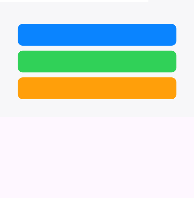
<Column> → Column
Vertical flex; gap, padding, alignment; children flex with weight.
<Column gap={10}>
  <Box height={44} background="#FF0A84FF" cornerRadius={10} />
  <Box height={44} background="#FF30D158" cornerRadius={10} />
  <Box height={44} background="#FFFF9F0A" cornerRadius={10} />
</Column>
<Row> → Row
Horizontal flex; weight distributes leftover space.
<Row gap={10}>
  <Box weight={1} height={64} background="#FF0A84FF" cornerRadius={10} />
  <Box weight={2} height={64} background="#FF30D158" cornerRadius={10} />
  <Box weight={1} height={64} background="#FFFF9F0A" cornerRadius={10} />
</Row>
<Stack> → Stack
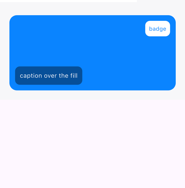
Layered children; top/right/bottom/left props position them absolutely.
<Stack width="fill" height={160}>
  <Box width="fill" height={160} background="#FF0A84FF" cornerRadius={16} />
  <Box top={12} right={12} padding={8} background="#FFFFFFFF" cornerRadius={10}>
    <Text label="badge" fontSize={12} color="#FF0A84FF" />
  </Box>
  <Box bottom={12} left={12} padding={10} background="#66000000" cornerRadius={10}>
    <Text label="caption over the fill" fontSize={13} color="#FFFFFFFF" />
  </Box>
</Stack>
<Wrap> → Wrap
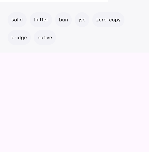
Flow layout — children wrap to the next line; gap sets both spacings.
<Wrap gap={8}>
  <For each={['solid', 'flutter', 'bun', 'jsc', 'zero-copy', 'bridge', 'native']}>
    {(t) => <Box padding={10} background="#FFF2F2F7" cornerRadius={999}>
      <Text label={t} fontSize={13} color="#FF1C1C1E" /></Box>}
  </For>
</Wrap>
<ScrollView> → SingleChildScrollView
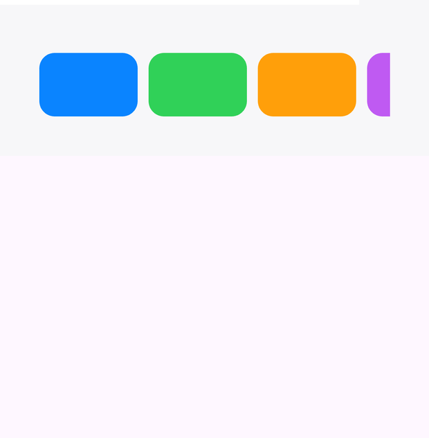
Eager scrolling for short content; axis 0 = vertical, 1 = horizontal. Use ListView for long lists.
<ScrollView axis={1} gap={10} height={90}>
  <For each={colors}>
    {(c) => <Box width={90} height={90} background={c} cornerRadius={14} />}
  </For>
</ScrollView>
Input
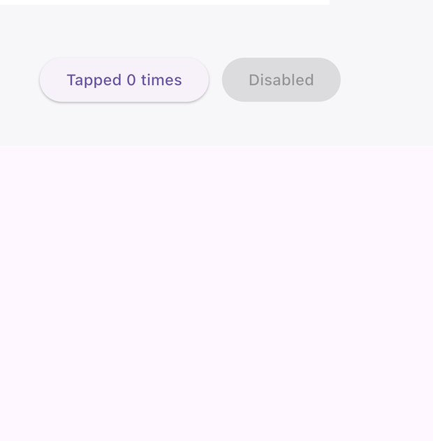
<Button> → ElevatedButton
label + onClick; disable with enabled={false}.
<Button label="Continue" onClick={() => submit()} />
<Button label="Disabled" enabled={false} />
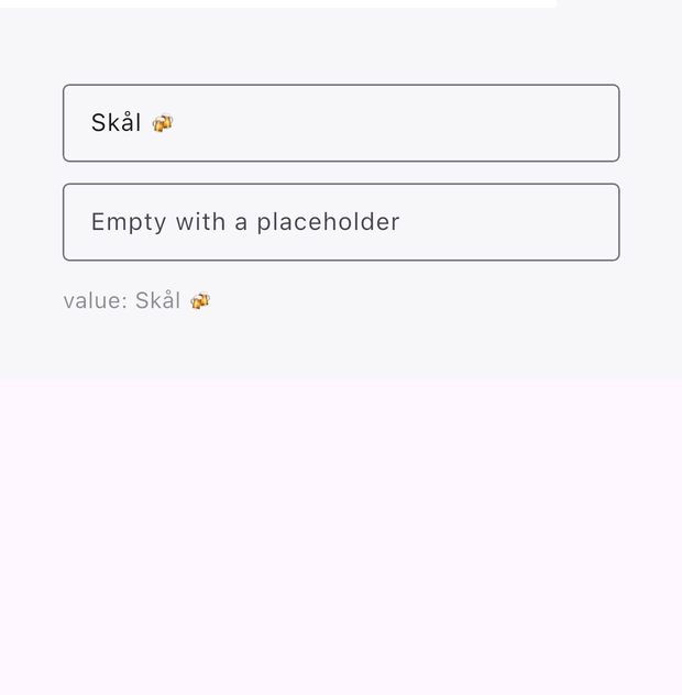
<TextInput> → TextField
Controlled text field — onChange per keystroke, onSubmit on Enter, secureEntry for passwords.
<TextInput value={name()} placeholder="Your name…"
           onChange={setName} onSubmit={(v) => save(v)} />
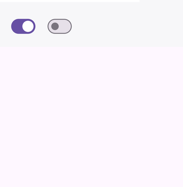
<Switch> → Switch
Boolean toggle; the app owns the state.
<Switch checked={on()} onChange={setOn} />
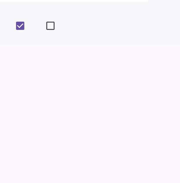
<Checkbox> → Checkbox
Checked/unchecked; onChange(bool).
<Checkbox checked={done()} onChange={setDone} />
<Radio> → Radio
One option in a group the app owns — onChange fires with true.
<For each={options}>
  {(opt, i) => <Row gap={8}>
    <Radio checked={sel() === i()} onChange={() => setSel(i())} />
    <Text label={opt} fontSize={14} />
  </Row>}
</For>
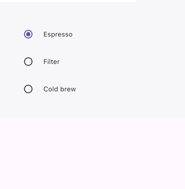
<Chip> → FilterChip
Toggleable filter chip — label, checked, onChange(bool).
<Chip label="Solid" checked={f().solid} onChange={(v) => toggle('solid', v)} />
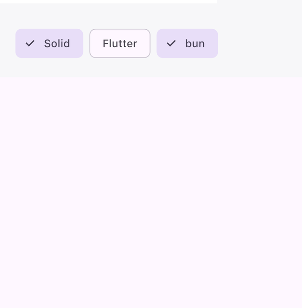
<SegmentedButton> → SegmentedButton
One-of-N selector; children are the segment labels.
<SegmentedButton activeTab={seg()} onChange={setSeg}>
  <Text label="Day" fontSize={13} />
  <Text label="Week" fontSize={13} />
  <Text label="Month" fontSize={13} />
</SegmentedButton>
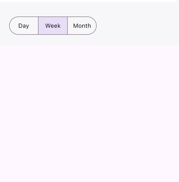
<Dropdown> → DropdownButton
Select from a menu; children are the options.
<Dropdown activeTab={dd()} onChange={setDd}>
  <Text label="Low" fontSize={14} />
  <Text label="Medium" fontSize={14} />
  <Text label="High" fontSize={14} />
</Dropdown>
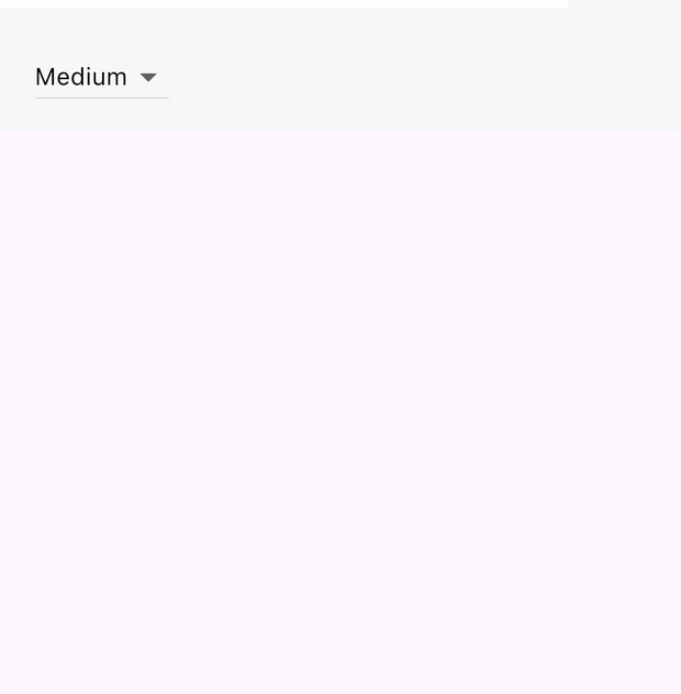
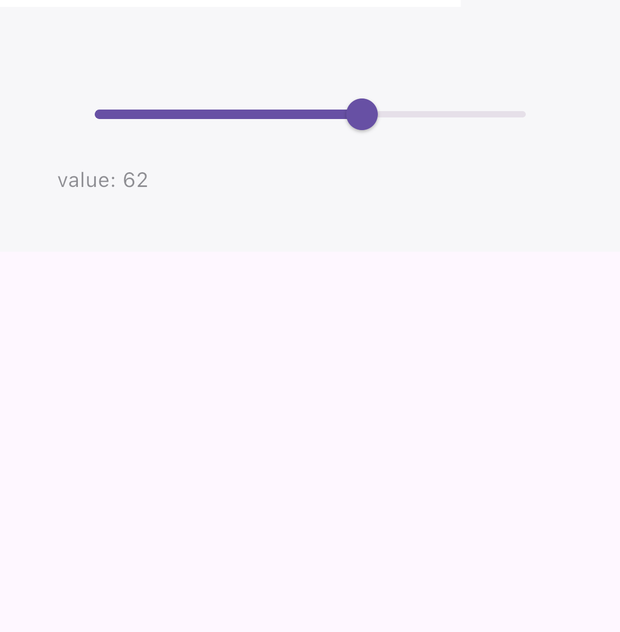
<Slider> → Slider
Continuous value between min and max.
<Slider value={vol()} min={0} max={100} onChange={setVol} />
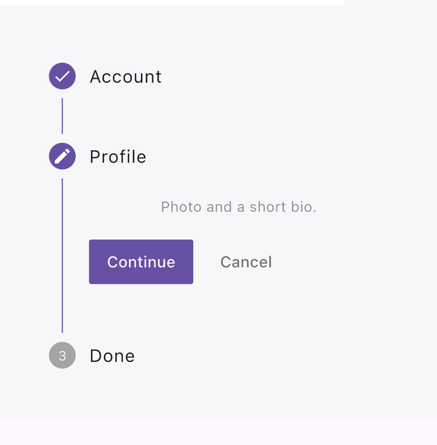
<Stepper> → Stepper
Multi-step flows; each Step has a title and a body.
<Stepper activeTab={step()} onChange={setStep}>
  <Step title="Account"><Text label="Name, email, password." fontSize={13} /></Step>
  <Step title="Profile"><Text label="Photo and a short bio." fontSize={13} /></Step>
  <Step title="Done"><Text label="Review and finish." fontSize={13} /></Step>
</Stepper>
Lists
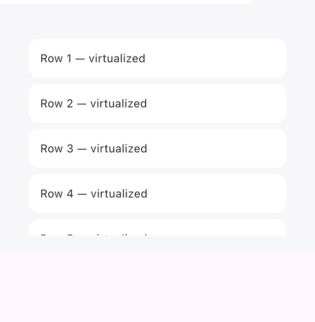
<ListView> → ListView.builder
Lazy, virtualized list — thousands of rows stay smooth. axis 1 for horizontal.
<ListView gap={8} height={260}>
  <For each={rows()}>
    {(r) => <Box padding={14} background="#FFFFFFFF" cornerRadius={12}>
      <Text label={r} fontSize={14} color="#FF1C1C1E" /></Box>}
  </For>
</ListView>
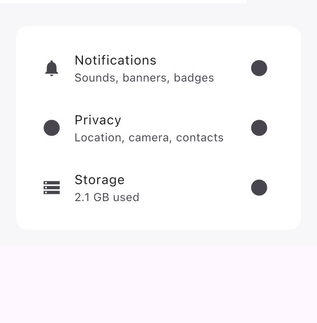
<ListTile> → ListTile
title, subtitle, leading/trailing icons, onTap — the settings-row workhorse.
<ListTile title="Notifications" subtitle="Sounds, banners, badges"
          leadingIcon="notifications" trailingIcon="chevron_right"
          onTap={() => open('notifications')} />
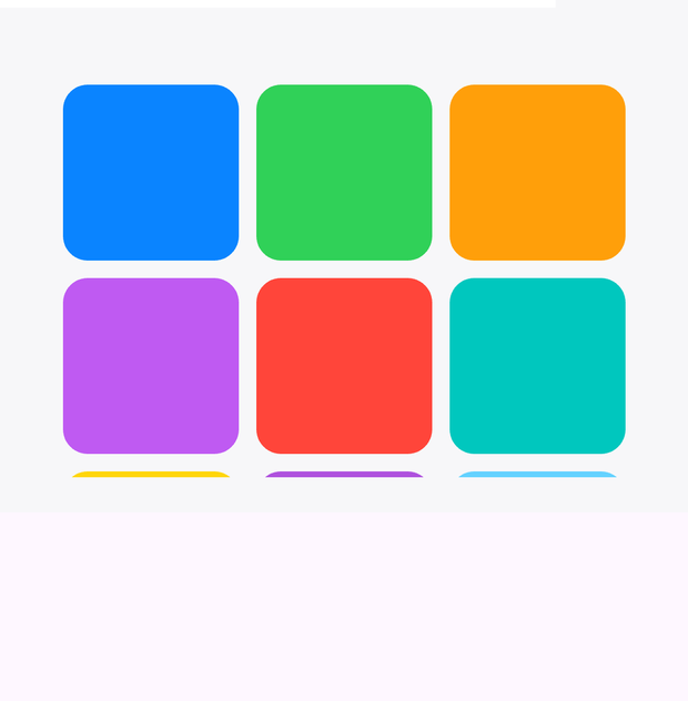
<LazyGrid> → GridView.builder
Virtualized grid; crossAxisCount columns, aspectRatio per cell.
<LazyGrid crossAxisCount={3} aspectRatio={1} gap={10} height={240}>
  <For each={items}>
    {(c) => <Box background={c} cornerRadius={14} />}
  </For>
</LazyGrid>
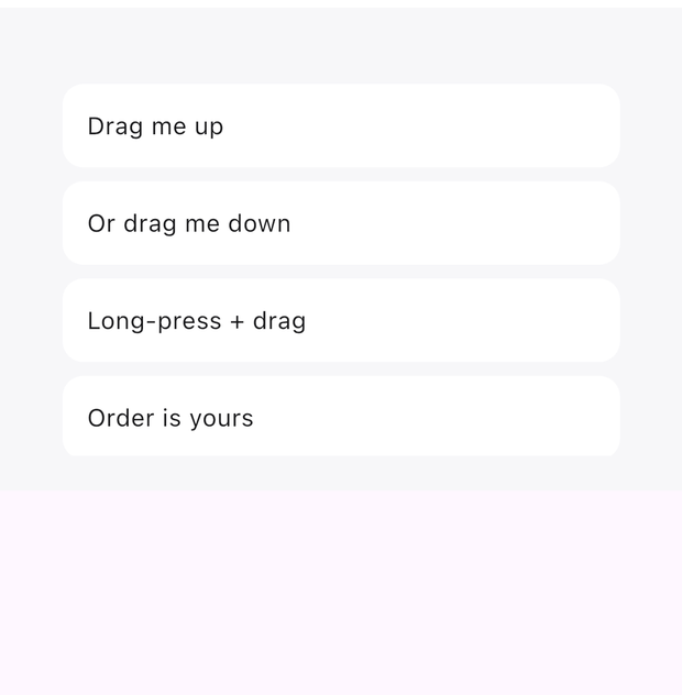
<ReorderableListView> → ReorderableListView.builder
Drag rows to reorder; onReorder(from, to) updates your source array.
<ReorderableListView height={230} gap={8} onReorder={(from, to) => move(from, to)}>
  <For each={rows()}>
    {(r) => <Box padding={14} background="#FFFFFFFF" cornerRadius={12}>
      <Text label={r} fontSize={14} color="#FF1C1C1E" /></Box>}
  </For>
</ReorderableListView>
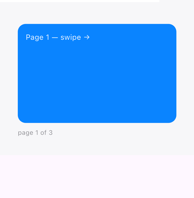
<PageView> → PageView
Swipeable pages; activeTab is the page index.
<PageView activeTab={page()} onChange={setPage} height={200}>
  <Box background="#FF0A84FF" cornerRadius={16} />
  <Box background="#FF30D158" cornerRadius={16} />
  <Box background="#FFFF9F0A" cornerRadius={16} />
</PageView>
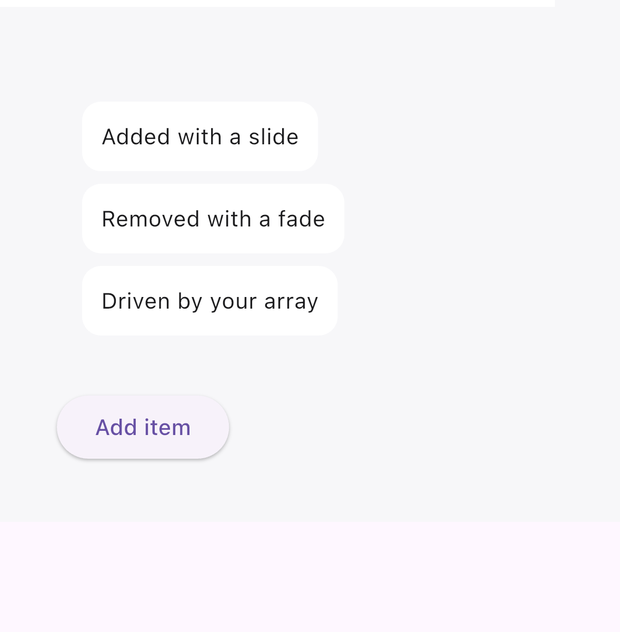
<AnimatedList> → AnimatedList
Items animate in and out as your array changes.
<AnimatedList height={220}>
  <For each={items()}>
    {(t) => <Box padding={12} background="#FFFFFFFF" cornerRadius={12}>
      <Text label={t} fontSize={14} color="#FF1C1C1E" /></Box>}
  </For>
</AnimatedList>
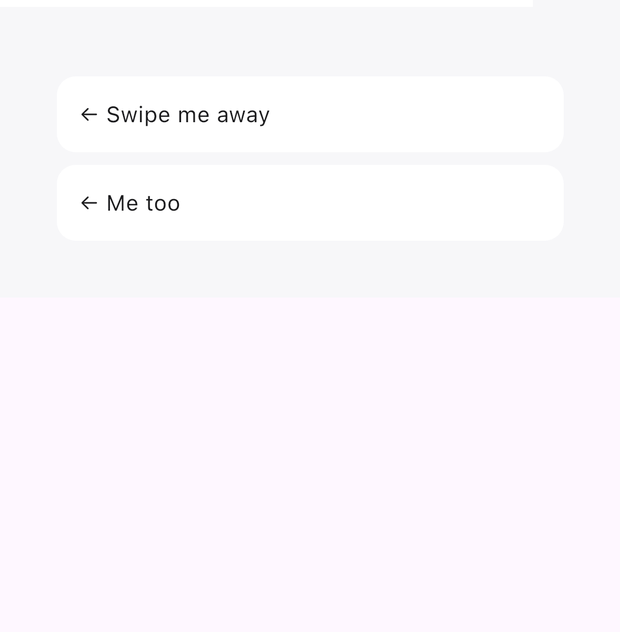
<Dismissible> → Dismissible
Swipe a row away; onDismiss removes it from your data.
<Dismissible onDismiss={() => remove(item.id)}>
  <Box padding={14} background="#FFFFFFFF" cornerRadius={12}>
    <Text label="Swipe me away" fontSize={14} color="#FF1C1C1E" />
  </Box>
</Dismissible>
Navigation
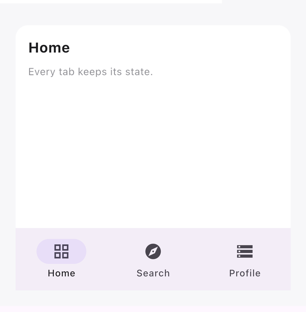
<Tabs> → NavigationBar + IndexedStack
Bottom tab navigation; every tab stays mounted (state survives switching).
<Tabs activeTab={tab()} onChange={setTab} height="fill">
  <Tab title="Home" icon="grid"><Home /></Tab>
  <Tab title="Search" icon="explore"><Search /></Tab>
  <Tab title="Profile" icon="storage"><Profile /></Tab>
</Tabs>
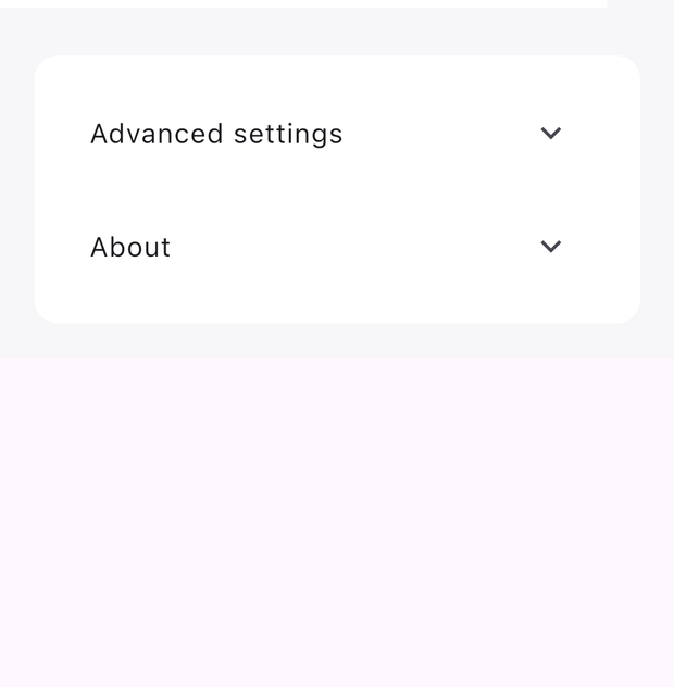
<ExpansionTile> → ExpansionTile
Collapsible section; the host animates open/close.
<ExpansionTile title="Advanced settings">
  <Box padding={14}>
    <Text label="Hidden until expanded." fontSize={13} />
  </Box>
</ExpansionTile>
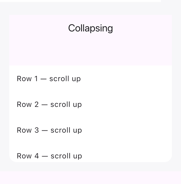
<SliverAppBar> → CustomScrollView + SliverAppBar
Collapsing header inside a sliver scroll — pinned, floating, or both.
<CustomScrollView height={320}>
  <SliverAppBar title="Collapsing" height={120} sliverMode="pinned" />
  <SliverList>
    <For each={rows}>{(r) => <ListTile title={r} />}</For>
  </SliverList>
</CustomScrollView>
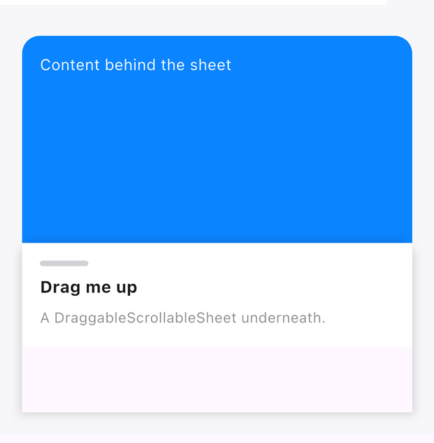
<BottomSheet> → DraggableScrollableSheet
Drag-resizable sheet anchored to the bottom of a Stack.
<Stack width="fill" height={340}>
  <Box width="fill" height={340} background="#FF0A84FF" cornerRadius={16} />
  <BottomSheet initialSize={0.45} minSize={0.2} maxSize={0.9}>
    <Column padding={16} gap={8} background="#FFFFFFFF">
      <Text label="Drag me up" fontSize={15} fontWeight={700} />
    </Column>
  </BottomSheet>
</Stack>
Effects
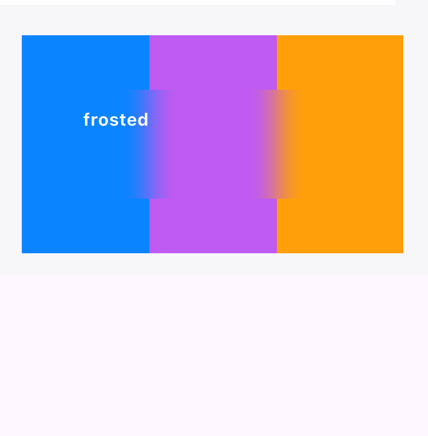
<BackdropFilter> → BackdropFilter
Frosted-glass blur over whatever is behind it in a Stack.
<Stack width="fill" height={200}>
  {/* colorful content… */}
  <Box top={50} left={40} right={40} height={100}>
    <BackdropFilter blurRadius={14}>
      <Text label="frosted" fontSize={16} />
    </BackdropFilter>
  </Box>
</Stack>
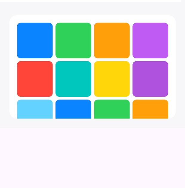
<InteractiveViewer> → InteractiveViewer
Pinch-zoom and pan around a child.
<InteractiveViewer minScale={0.5} maxScale={4}>
  <Image src="…" width="fill" height={220} />
</InteractiveViewer>
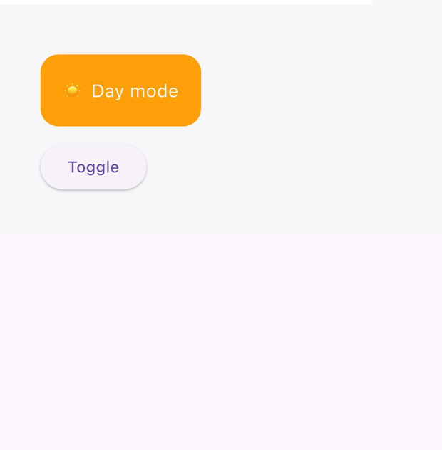
<CrossFade> → AnimatedSwitcher
Cross-fades between children when the content swaps.
<CrossFade>
  {day() ? <SunCard /> : <MoonCard />}
</CrossFade>
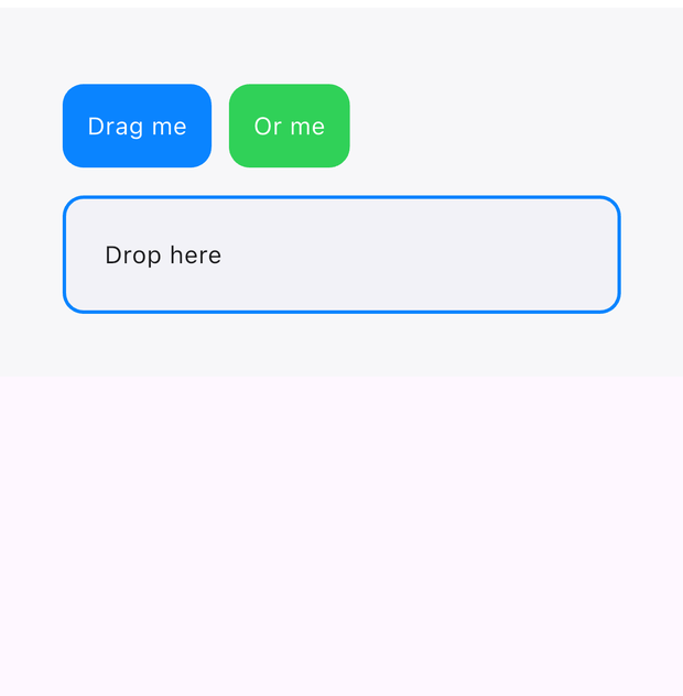
<DragItem & DropZone> → Draggable + DragTarget
Native drag-and-drop; the drop zone receives the item id.
<DragItem dragData="card-1">
  <Box padding={14} background="#FFFFFFFF" cornerRadius={12}>
    <Text label="Drag me" fontSize={14} />
  </Box>
</DragItem>
<DropZone onDrop={(id) => setDropped(id)}>
  <Box padding={24} borderWidth={2} borderColor="#FF0A84FF" cornerRadius={12}>
    <Text label={dropped() ?? 'Drop here'} fontSize={14} />
  </Box>
</DropZone>
Not pictured
Navigator/Screen and Hero are navigation transitions (see createRouter), Drawer is the edge-swipe panel, SafeArea is inset plumbing, and dialogs/snackbars/pickers are imperative calls (showDialog, showActionSheet, showSnackbar, showDatePicker, showTimePicker) — one-liners from skal/renderer. Web escape hatches: HtmlEmbed and FlutterEmbed.